Wednesday, August 23, 2006

Potty Art No.1/ Visual Darwinism


Awkward Moment no.1


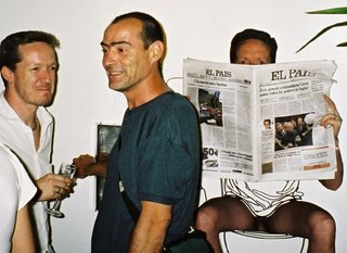
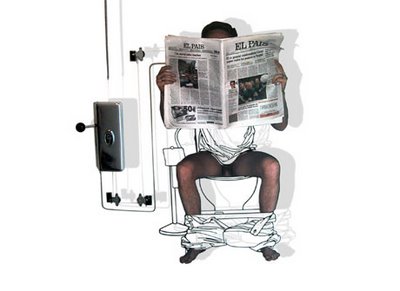
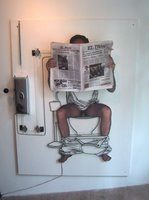
Awkward Moment no.1, "Intimate Moments with Tom and Frank", Cold Creation Gallery, Barcelona, Spain, 2002


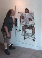
Awkward Moment #1 is the first work in a series by the artists Frank Plant and Thomas Charveriat. The series deals interactively with the issue of moments that are normally not meant for sharing. The artists put the viewer in the role of intruder in hopes of generating the feeling of invasiveness that normally accompanies such delicate moments. Awkward Moment #1 is a composition of steel and photography showing a man seated on a toilet reading a newspaper.
When the viewer pulls the handle attached to the left side of the steel structure, the newspaper lowers and the upper part of the scowling face of the man is exposed and shouts angrily: "Do you mind?!?!". This is the moment that almost everyone has experienced, the moment that an individual walks in on someone unexpectedly and the immediate sense of surprise, shame and vulnerability created from it. The dynamic of the piece is to force the spectator to back away from the work with a sense of invasive shame and guilt.

Work created in collaboration with Thomas Charveriat
Sound Design by Denis Menard
Voice by Richard Felix
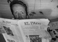

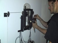
R&D in the studio

Okay That's the official version, now a bit more about working with humor in art in general. I like humor and I also believe that it is a very strong tool with which to communicate to people. If you can get them to laugh I think you are going a long way in opening the door for deeper communication. Nobody's going to argue that we live in a visually saturated world and anybody that's involved in the struggle of creating provacative and engaging images is going to tell you that making a lasting impression on today's viewer is extremely challenging.

This Factoid is from
  • Gullible.Info
  • which is a pretty cool site, here's the link

    • Every minute, the human brain processes about 17GB of visual input, 5GB of audio input 20MB of tactile input, 350kB of olfactory input, and 100 kB of gustatory input.

    Meaning there is a hell of alot competition for our attention, especially if you put yourself in an environment where you are specifically seeking visual stimulation, i.e. Museums, Galleries, etc.... Now I won't go into the deteriorating state of western man's attention span or his capacity for concentration but needless to say it's gone downhill with the advent of the remote control (among other things).

    preliminary pulley system in the studio


    In my struggle with what could be called "Visual Darwinism" (remember you heard it here first), I find that humor as well as irony are great tools for creating a more lasting experience in today's saturated and jaded viewer. Also the advent of post-modernism unleashed a tsunami of hyper subjective hog wash on the poor unsuspecting viewer which I believe led to a general marginalization of the spectator. Don't get me wrong, I believe that post-modernism marshalled in some well needed changes, I also don't feel that it's the artist's responsibility to cater to current trends and dumb down content to reach a wider audience if that's not there objective. Before I get to far down the dark alleys of some discourse on modern art just let me say that I think a bit of humor can help (as can many things well applied I suppose) an image or idea stick a bit more in the mind of the viewer.
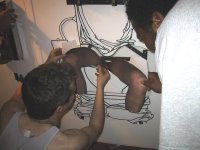

    Mounting the Fotos which had adhesive on the back


    Having said that do I think that everyone should rush forth and add a dash of sophmoric humor to their work? Most certainly not, but if the predilection is there it is well worth the research. The Awkward Moment pieces for me use humor as an entrance to the edgier feelings of intrusiveness, vulnerability and SHAME! Yes Shame on you!


  • Awkward Moment no.1 video

  • The final pully structure

    Awkward Moment no.1, "Intimate Moments with Tom and Frank", Cold Creation Gallery, Barcelona, Spain, 2002

    Friday, August 04, 2006

    Is Nothing Sacred? The Chilies/Liebeskind and Favelas

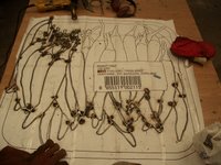
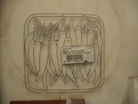
    "The Chilies", Steel bar and plate, 98x97cm, 2006 (First three images), no not a Red Hot Chilly Peppers cover band but what started off as a simple purchase at the local Asian food importers and put through the filter of my brain. I was attracted to this image because as you'll see in a lot of my work I like to work with compositions that a certain amount of repetition as well as chaos, I think the technical word for it is entropy, or structured chaos.


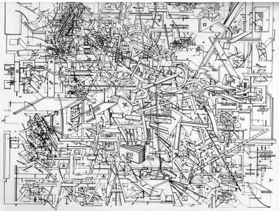
    I was first attracted to these images from the then experimental architect Daniel Liebeskind who did a series of drawings called "Macromegas" that were published in a poncey art journal I once saw. Although there is not a lot of repetition in these works I was very interested in their dynamism and volatility.


    This amount of visual information, detail and a splash of chaos is sometimes what I look for in subjects that I like to portray, the difference is that I normally like to find the information in nature whether it be or man made environments as you see in the favela series that I do or in the Fingerprint series etc....


    The Chillies in their new home in Amsterdam


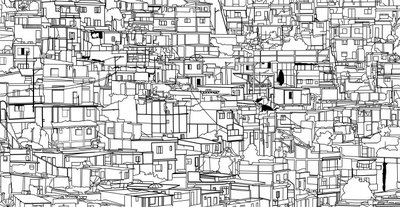
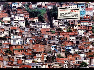
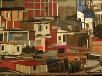
    Above you have a detail of one of Liebeskind's "Macromegas" this one titled " Vertical Horizons", I changed the orientation for presentation's sake. Below you have a drawing I did of a favela from a detail of a photo I tracked down on the Internet. and the following the original material.


    Well when I see images of favelas, shantie towns, townships and or certain urban environments, I start to get a bit excited. The magnitude of some of them, whether creeping up mountainsides or stretched out in valleys, i find truly amazing. Not only from just the sheer quantity visual information available but obviously what it represents as well. Humankind as an organism, in this case with very little resources, sprawling out to accomadate itself in any way possible and using every material at hand to create some sort of lodging or shelter for themselves. So far I have or have had created three different versions of the favela drawing I've made .

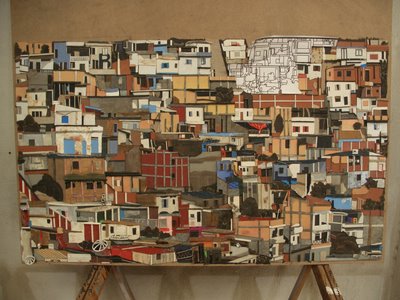
    In the studio, Favela III, Mixed Media, 100x80, 2006

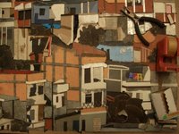
    The first one started but not the first one finished, is Favela no.3, Mixed Media on MDF support, 126.5x76.5cm, 2006. is made completely out of recycled material in a collage/relief form. I think the manner that it's created is appropriate to the subject matter and I'm quite happy with the result.
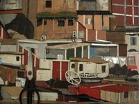
    Below you have three details of the same work...


    Favela III, Mixed Media, 100x80, 2006 (Details)


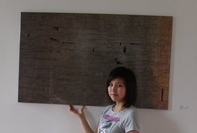
    Favela II, Engraved Stainless Steel, 100x80, 2006

    The first and second were realized in Shanghai, China with the help of Thomas Charveriat of Island Six Arts Center and exhibited in the show "Invisible Layers, Electric Cities" Curated by Margherita Salmosa and Allard van Hoorn. The one in the picture with one of my loyal chinese followers in front of it is creatively titled "Favelas II" is an engraved plate of stainless steel which is then hand painted by highly skilled chinese craftsmen. Island Six is a very interesting new initiative which I'll cover more of later

  • Island6 Arts Center

  • Island 6 Arts Center, brainchild of one Thomas Charveriat, international Playboy and artistic mover and shaker.....

    Sheilas Nos. 1 and 2 (Don't report me read the text first!)


    Sheila no.2 (Kneeling), Steel, 100cm x 126cm, 2005


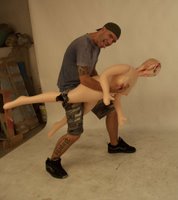
    While working on “WH(Y)” I came into contact with Sheila. Sheila is an inflatable sex doll. In case your curious she came with the name and her chosen line of work is law enforcement, she packs a gun. I bought Sheila because I couldn’t really do a piece on the male state without involving sex but I didn’t want to incorporate graphically intimate images. Sheila was the solution, she represents the act of sex as one of desperation. Flesh and blood substituted by plastic and air, reality by fantasy. In “WH(Y)” she figures no fewer than six times and she is a patient and flexible model. In the process of having her around the studio the reactions, male and female, that people had to her were quite curious and strong. People reacted with intrigue and curiosity to what could be considered a symbol of our darker, more instinctual and desperate side. Hence Sheila no.1 (reclining) 192cm x 42cm and Sheila no.2 (Kneeling), 100cm x 126cm. Pieces that at once are provocative in the male objectification and idealization of the female form and miserably sad as measures of the levels of deprivation that human desire can bring.


    Sheila no.1 (reclining), Steel, 192cm x 42cm, 2005


    WH(Y)?


    WH(Y)?, Painted Steel, 218cm x 125cm, 2006


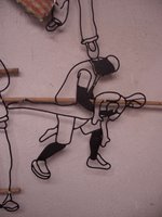
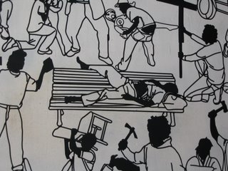
    “WH(Y)” is a sardonic reflection on the male condition, the name is taken from the chromosome that determines male sexuality shortly after conception. The piece’s focus is on certain male tendencies such as violence, imperialism, our love of motor vehicles, vagrancy, evangelism, sex with inflatable inanimate objects, voyeurism, etc…. it’s a humorous take on some of our less attractive habits. The composition consists of about forty small figures, average size 40cm, that are mostly portraits of people that have visited the studio recently and graciously posed in any number of compromising positions. The remainder of the shots I took outside of the studio. The figures are made out of welded steel bar and plate steel cut accordingly and the whole piece measures 218cm x 125cm. I improvised a lot with the composition and feel I came up with a fairly dynamic solution. I’m very content with the orientation towards detail and look forward to investigating it more in the future.


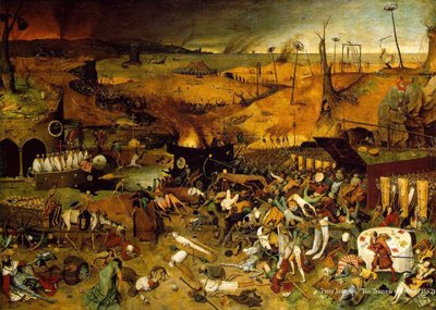
    Peter Brueghel, The Triumph of Death, 1562


    I would be remiss in not citing at least two influences that I had in working with this type of composition. Besides having a natural predilection for the busy and dynamic, I do find alot of inspiration in the works of Peter Brueghel and Hieronymous Bosch. Both of their attention to detail and imagination I find staggering. Bosch was as and continues to be as provacative as Dali but four hundred years earlier.


    Hieronymous Bosch, Death and the Miser, c.1490

    Both of these fellas were out there, just drumming out the most macabre stuff from the deepest recesses of their imaginations. I find it absolutely awe-inspiring.


    My Good Friend Ari was an exuberant model, here he is in action with Sheila.


    And here is the reproduction in steel that forms a part of the piece.


    Another detail of WH(Y)?