Awkward Moment no.1

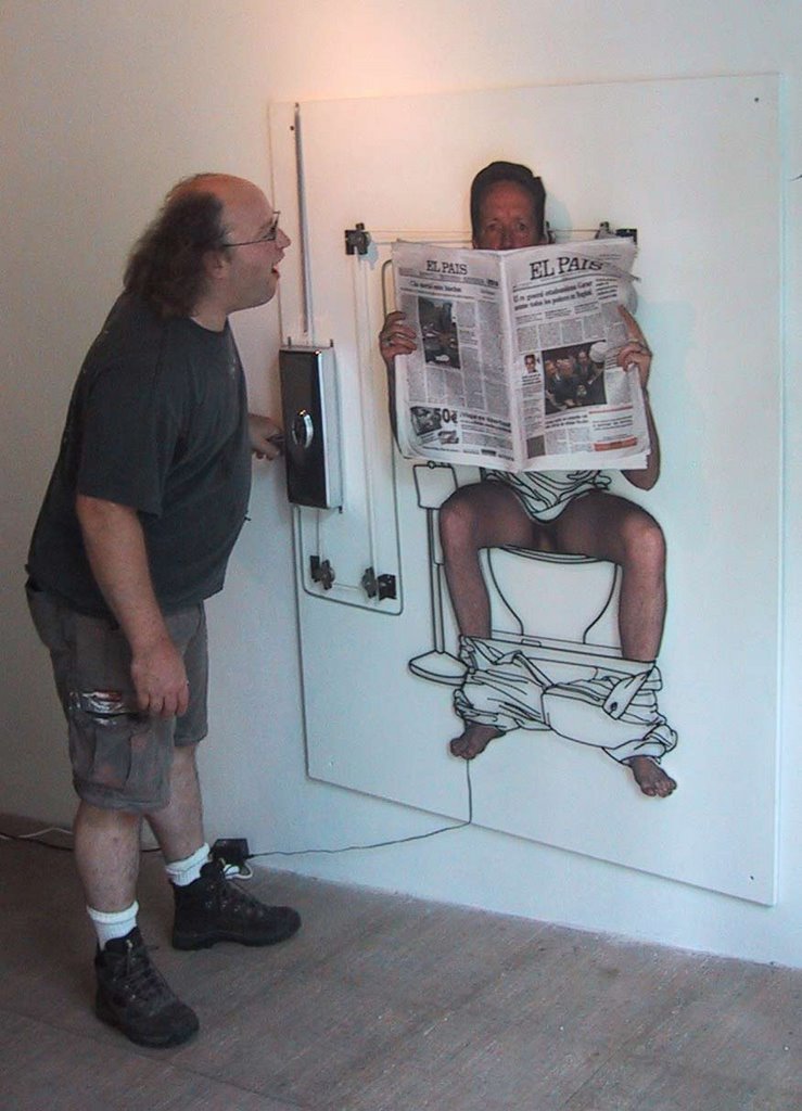
Awkward Moment no.1, "Intimate Moments with Tom and Frank", Cold Creation Gallery, Barcelona, Spain, 2002
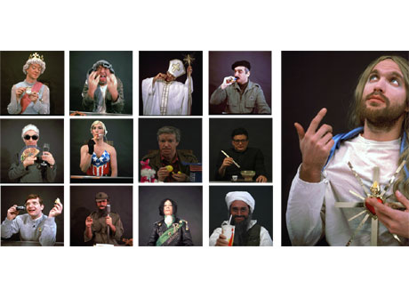
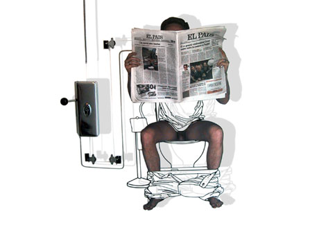
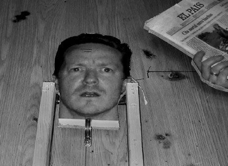
Awkward Moment #1 is the first work in a series by the artists Frank Plant and Thomas Charveriat. The series deals interactively with the issue of moments that are normally not meant for sharing. The artists put the viewer in the role of intruder in hopes of generating the feeling of invasiveness that normally accompanies such delicate moments. Awkward Moment #1 is a composition of steel and photography showing a man seated on a toilet reading a newspaper.
When the viewer pulls the handle attached to the left side of the steel structure, the newspaper lowers and the upper part of the scowling face of the man is exposed and shouts angrily: "Do you mind?!?!". This is the moment that almost everyone has experienced, the moment that an individual walks in on someone unexpectedly and the immediate sense of surprise, shame and vulnerability created from it. The dynamic of the piece is to force the spectator to back away from the work with a sense of invasive shame and guilt.
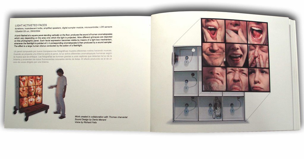
Work created in collaboration with Thomas Charveriat
Sound Design by Denis Menard
Voice by Richard Felix
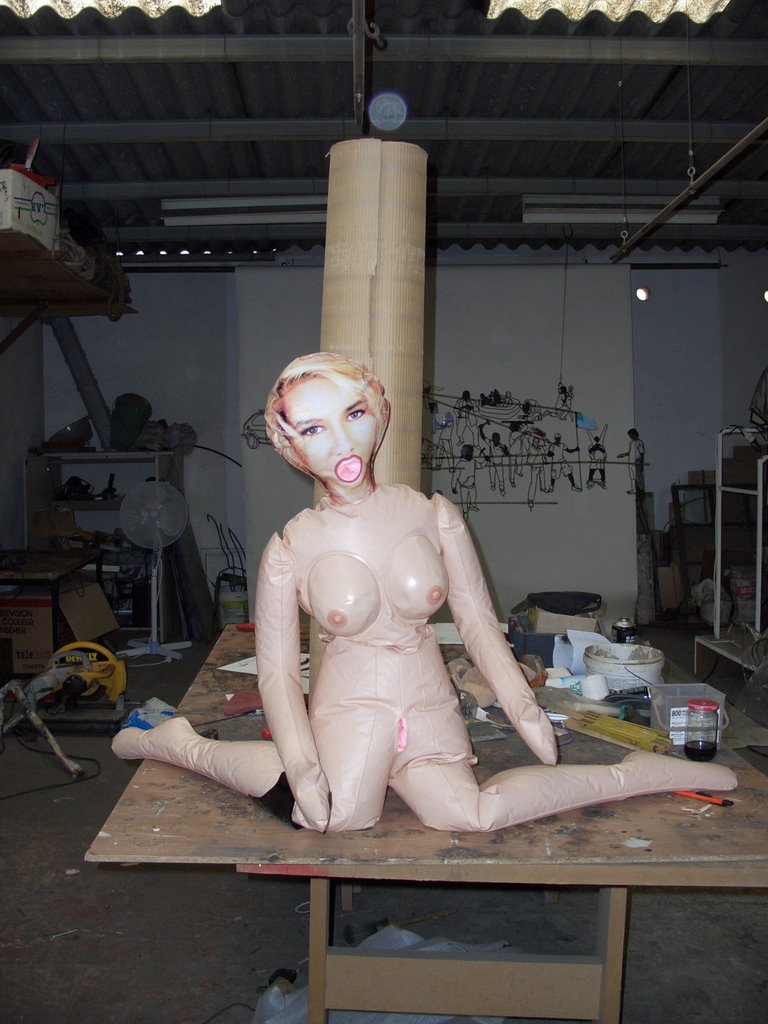
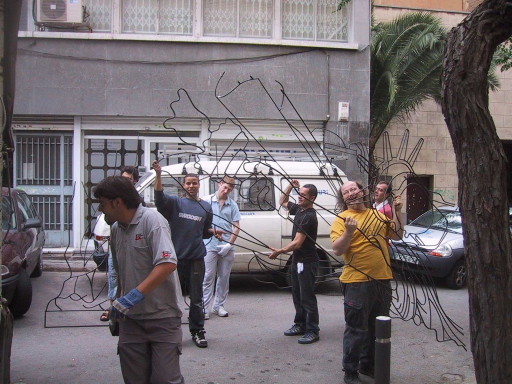
 R&D in the studio
Okay That's the official version, now a bit more about working with humor in art in general. I like humor and I also believe that it is a very strong tool with which to communicate to people. If you can get them to laugh I think you are going a long way in opening the door for deeper communication. Nobody's going to argue that we live in a visually saturated world and anybody that's involved in the struggle of creating provacative and engaging images is going to tell you that making a lasting impression on today's viewer is extremely challenging.
This Factoid is from
• Every minute, the human brain processes about 17GB of visual input, 5GB of audio input 20MB of tactile input, 350kB of olfactory input, and 100 kB of gustatory input.
Meaning there is a hell of alot competition for our attention, especially if you put yourself in an environment where you are specifically seeking visual stimulation, i.e. Museums, Galleries, etc.... Now I won't go into the deteriorating state of western man's attention span or his capacity for concentration but needless to say it's gone downhill with the advent of the remote control (among other things).
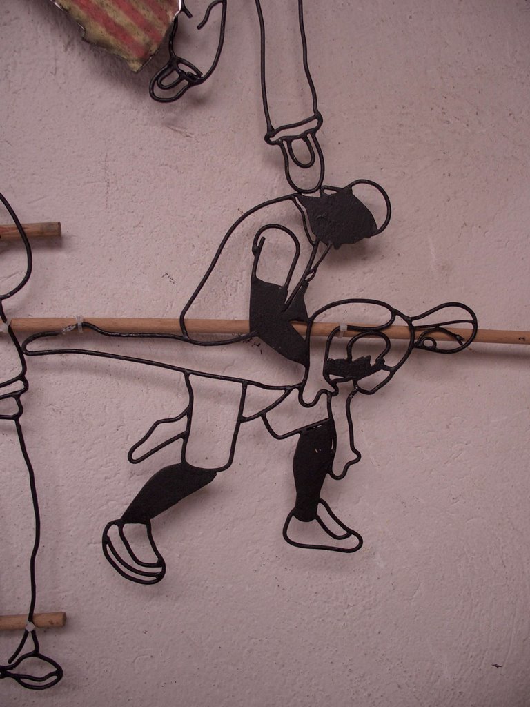
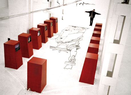
 preliminary pulley system in the studio
In my struggle with what could be called "Visual Darwinism" (remember you heard it here first), I find that humor as well as irony are great tools for creating a more lasting experience in today's saturated and jaded viewer. Also the advent of post-modernism unleashed a tsunami of hyper subjective hog wash on the poor unsuspecting viewer which I believe led to a general marginalization of the spectator. Don't get me wrong, I believe that post-modernism marshalled in some well needed changes, I also don't feel that it's the artist's responsibility to cater to current trends and dumb down content to reach a wider audience if that's not there objective. Before I get to far down the dark alleys of some discourse on modern art just let me say that I think a bit of humor can help (as can many things well applied I suppose) an image or idea stick a bit more in the mind of the viewer.
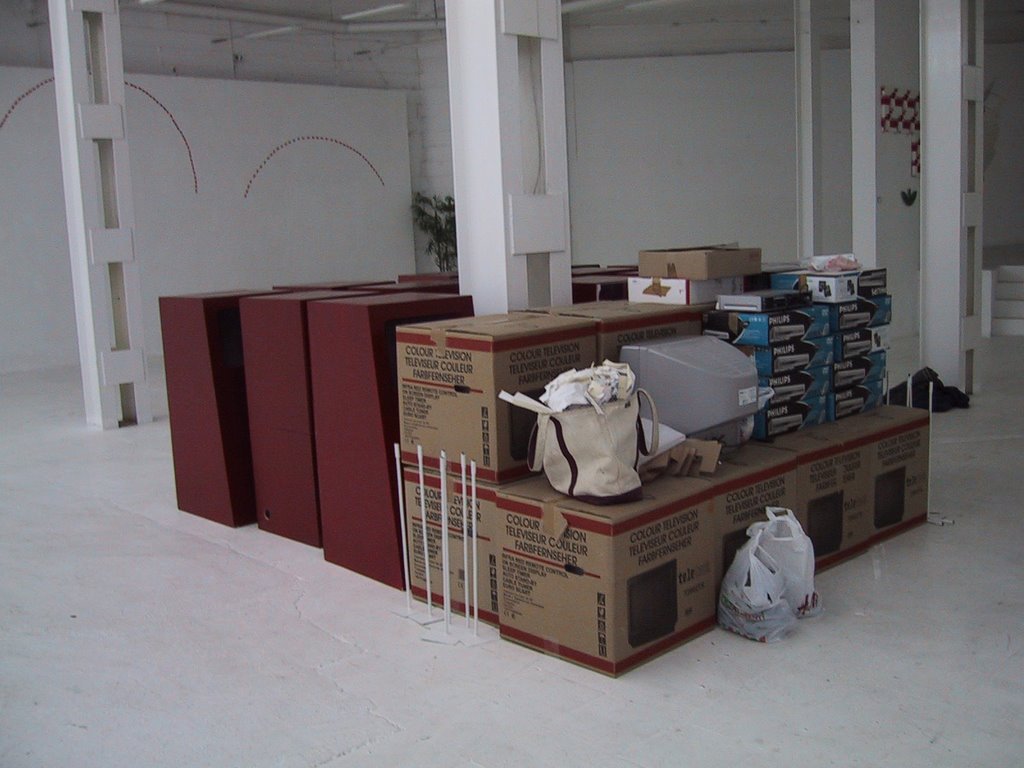
 Mounting the Fotos which had adhesive on the back
Having said that do I think that everyone should rush forth and add a dash of sophmoric humor to their work? Most certainly not, but if the predilection is there it is well worth the research. The Awkward Moment pieces for me use humor as an entrance to the edgier feelings of intrusiveness, vulnerability and SHAME! Yes Shame on you!
 The final pully structure
 Awkward Moment no.1, "Intimate Moments with Tom and Frank", Cold Creation Gallery, Barcelona, Spain, 2002